
The most important element in a website: usability.
Summary: A proper design allows users to find the information they need and complete the objectives they came to your site for. To achieve usability in a government healthcare site, the most important changes included:
- Better indicate the user’s current location.
- Moving accessibility tools to more intuitive locations.
- Decreasing the scrolling needed to access information with more pages.
User research is fundamental at every step of the process. Have in mind the goals of the user in your site to design an intuitive path to achieve those goals.
A website needs to be designed to serve the user, it has to minimize the effort the user exerts to achieve their objective. Usability is the most important factor to create a satisfying experience because without it; users will become frustrated, they will be unable to obtain what they want and leave with a negative perception of the brand.
The following case study is about how to make a website easy to use for elderly people brings relevant insights on how to design a usable website that offers a seamless, intuitive, and satisfying experience, encouraging users to return rather than driving them to competitors.
Case study: the National Institute of Health designed a website design focused on the elder.
One illustrative example of successful UX design comes from a study on the NIH SeniorHealth.gov website, as presented in the research paper “Improving the Usability of the NIH SeniorHealth.gov Website for Its Target Audience” by Kristen Davis and Dick Horst (2015). This research highlights the concerted effort to update and enhance the usability of the NIH SeniorHealth.gov website, specifically tailored to meet the evolving needs of its older adult audience.
Four formative usability tests were conducted with representative users (older adults ages 60–75+). The usability test had two phases. The first one was to evaluate the wireframe, the second one to evaluate four functional prototypes. The third and fourth were intended to improve search functionality and results pages.
The study’s findings emphasize several crucial elements for achieving a good UX:
- Accessibility and Navigation: The redesign of the NIH SeniorHealth.gov website focused on making the site more accessible and easier to navigate. This included adding a main navigation bar at the top of every page, implementing a search feature, and moving accessibility tools to more intuitive locations.
- Content Presentation: The website transitioned to longer scrolling pages for health topics, away from shorter pages that required more clicks to access information. This approach aligns with best practices in UX design, which prioritize minimizing the effort required to access content.
- Clear Signposting: The introduction of breadcrumb navigation beneath the banner on every page (except the homepage) improved users’ understanding of their location within the site and how to navigate back or through related topics.
- Visual and Interaction Design: Updates included changes to the visual design of the left menu to better indicate the user’s current location and the segregation of complementary resources into a distinct section with a different visual treatment, enhancing the overall interaction design.
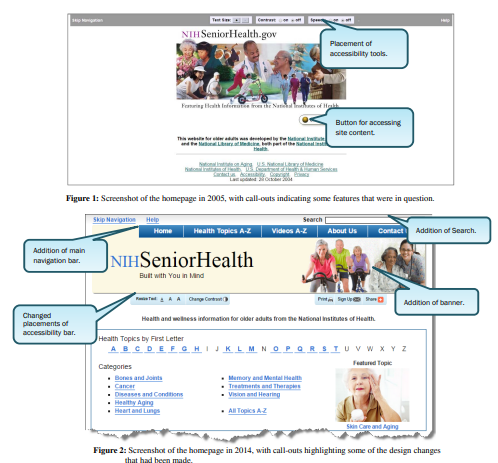
This is a picture of how the website looked before and after the update.
The successful redesign of the NIH SeniorHealth.gov website, evidenced by improved web analytics and customer satisfaction ratings, showcases the tangible benefits of prioritizing a good UX.
User-centered design plays a critical role in creating effective, engaging, and enjoyable online experiences. According to Google’s process to build digital systems it is essential to have a map of objectives and pain points of the user you are building for.
Key Takeaways
Researching the user is fundamental at every stage of the design process to achieve a site with good usability. In a user study, you need to understand the goals and record how the user interacts with the prototypes of your site.
Some elements that make the website easier to navigate include: having a menu at the top, adding a breadcrumb that facilitates understanding the user’s position on the site, and, if the site is very large, the search functionality is very useful for users to quickly find what they are looking for.
Plan the content structure based on these goals. Record the navigation path that must be taken and build it in such a way that the target user exerts the least amount of effort.
To achieve an intuitive design, you must design with current web design conventions, since people are already accustomed to navigating websites in certain ways. Do not reinvent the wheel in your design. If you change the position of all the elements, the user will have to relearn everything they know to achieve their goal. They won’t do it; they will just get frustrated and leave the site with a negative perception of your brand. This is why usability is key to closing sales, making your leads trust you.
Author: Santiago Correa Robles
References
Davis, K., & Horst, D. (2015). Improving the usability of the NIH seniorhealth. gov website for its target audience. Proceedings of the International Symposium on Human Factors and Ergonomics in Health Care, 4(1), 71–75. https://doi.org/10.1177/2327857915041030
https://www.coursera.org/learn/foundations-user-experience-design
Foundations of User Experience (UX) design. (2023, January 1). Coursera. https://www.coursera.org/learn/foundations-user-experience-design
Haque, M. (2023, February 8). What is Usability in UI Design? 15 Important Usability Principles for User Interface Design | Medium. Medium. https://medium.com/@mdmansurulhaques/15-important-usability-principles-for-user-interface-design-ea819cedeb36
Deja un comentario